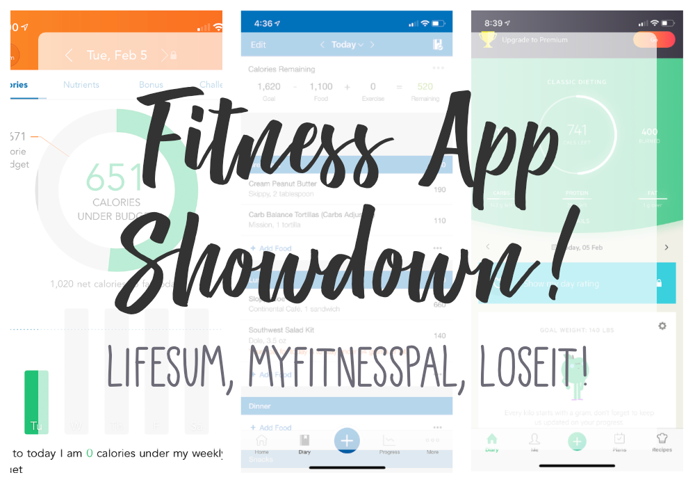
As a new mom who is no longer breastfeeding, I have chosen to start focusing on my health and losing weight. Currently, I am about 165 lbs and I want to get back down to my pre-pregnancy weight of 155 lbs. So I downloaded a new app called Lifesum, and as I’ve been using it over the past month I thought it would be interesting to compare it to previous fitness apps that I have used.
***This Showdown is solely on iOS software for iPhone devices.***
Lifesum – Link

iTunes Fitness Top Rated: #5
Rating: 4.7
Number of Ratings: 47.3K
Price: Free
But… there is a Premium Version you can upgrade to for 3 ($21.99), 6 ($29.99), & 9 ($44.99) Month intervals.
Visual Appeal: Modern+
Usability: Usable+
My Thoughts:
I like the visual for the landing page, it breaks down consumed vs. burned and focuses on what you have left that day. I think it’s backward that this chart is shown before the date. Then below the chart and the enticer for going premium is this GIANT box that screams for you to update your weight. Like ‘Hello!?!?” I know I’m not perfect, so I had a bowl of ice cream last night, get off my back! Then another ad to go premium and then you have a breakdown of your consumption for that day.
At the bottom of the screen is the primary navigation and in the center in the main action. the Add button.
Once you selected the Add button you have 5 choices; snack, exercise, breakfast, lunch, and dinner. If you select a meal you are brought to a screen where you can search for the food you want to add for that meal, or you can use the barcode scanner to add it. I love the barcode scanner, it makes adding food so much easier. Searching is difficult because calories and nutrients vary so much between brands and restaurants.
If you select the exercise you go to a page with a search option only.
In Lifesum you have to choose a meal plan to help you lose weight. For the FREE version, you can only choose the basic meal plan 🙁
Also with the free version, you can’t see the detailed nutrition breakdown. You can only see Carb, Fat Protein and Calories. That’s Disappointing.
You can log in using Facebook. Win.
I can’t find any linking of apps, such as the Apple Health App.
I primarily only use the Diary page, it has all the information that I need on it. since I’m using the Free version, the other pages mostly require the premium upgrade to be useful.
MyFitnessPal – Link

iTunes Fitness Top Rated: #4
Rating: 4.7
Number of Ratings: 493K
Price: Free
But…. there is also a Premium Version for $10/Month or $50/Year ($4.17/Month)
Visual Appeal: Meh.
Usability: Usable
My Thoughts:
The landing page is 80% Ad and 20% equation for Calories Remaining that day. This is a burn in my book, but I am using the FREE version. The primary navigation is on the bottom of the screen along with the primary “Click To Action”. The primary action being the ‘Add’ button, where you can add things such as food, exercise, water, or weight. I honestly think that LifeSum copied this interaction from Myfitnesspal.
The visual for Calories Remaining could use an update, I’m not in high school anymore and I would much prefer to not do math in my off time. Although is it kinda nice to see how everything adds up or cancels each other out.
The ability to add foods is very similar to Lifesum, it has a barcode scanner which I use all the time. Having to click “Multi-Add” selection is an extra step that should not be necessary and when you do select it everything shifts to the right and a radio button as selectors appear. In User Experience, radio buttons are used primarily for selecting 1 item and checkboxes are used to select multiple items. Although this isn’t a deal-breaker, because sometimes rules are meant to be broken.
Ads are annoying, but eventually, you look past them.
You can link with Apple Health App, I have yet to successfully do so with this app, but I will keep trying.
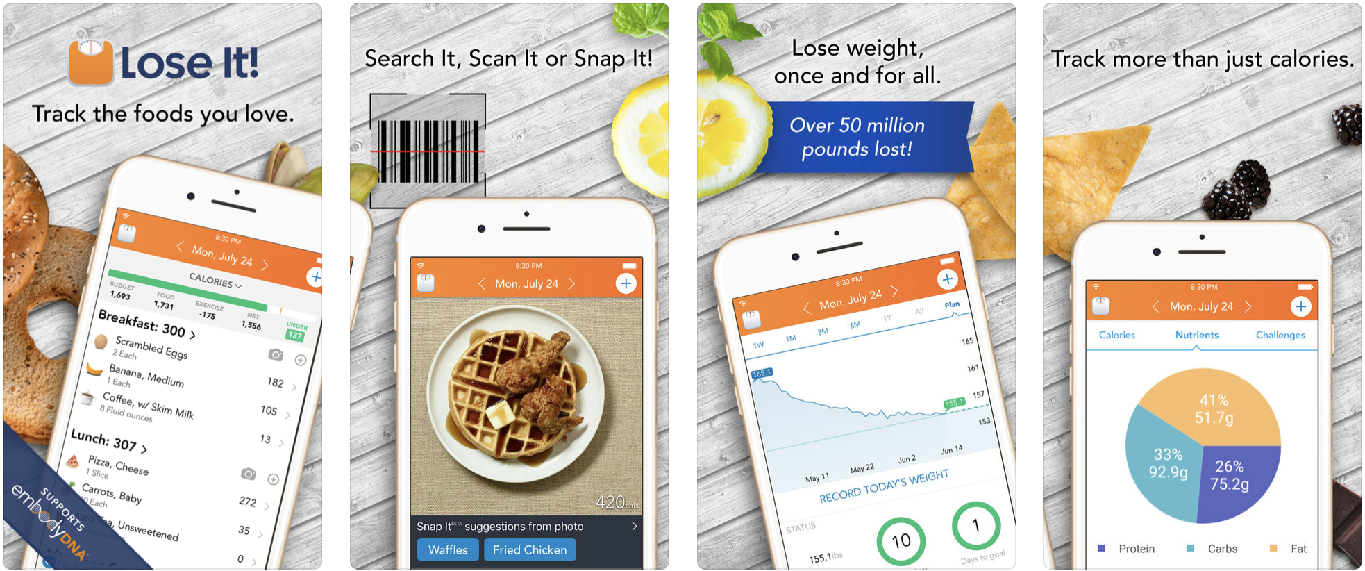
LoseIt! – Link
iTunes Fitness Top Rated: #7
Rating: 4.7
Number of Ratings: 242K
Price: Free
But…. you can do a subscription for $39.99/Year.
Visual Appeal: Meh.
Usability: Not Recommended for
NON-Technology Savy Users.
My Thoughts:
Badges are a good enticer to get you to stay on track.
Signing in using Facebook is awesome.
Personally, the app looks dated. The primary navigation is at the bottom of the screen, but the primary “Click To Action” is on the top right of the screen. To me, this is disconnecting, and jarring. When I say the primary action I mean how you add food to your daily log.
The Log page total at the top is too small and deserves more screen real-estate. People are familiar with scrolling so pushing the meals down the screen wouldn’t be a problem. There is also hidden functionality on the Log page, if you pull down on the screen you see your week’s progress. Not sure if I would’ve found it, for some reason I tried to refresh the screen by pulling it down when already viewing the top of the page. It is nice to be able to click into a specific meal and see the nutrient breakdown.
The visual aspect of the Log page is really busy, this is a negative for me. Life is busy, so the more difficult it is for me to sort through information and figure out what to select or take action on is decreases my chances of using the app.
Adding your daily water consumption is only available in the Premium version. This is silly, competitors offer this feature in their free version.
Adding food to your daily log is most helpful if you can use the barcode scanner. Showing accurate icons isn’t much of an ad, it just clutters up the interface.
This app does allow you to sync with Apple’s Health app, this is a big for us iPhone users along with Fitbit.
Overall I’m not very impressed with LoseIt! and I will likely not continue using this app.
Final Thoughts
After using and reviewing all three apps in detail I decided that I likely won’t be using the LostIt! app, because it is very busy and cluttered. The nutritional breakdown isn’t very helpful, and the social aspect of the application does not entice me. Personally, I’m using this app for me, not as a social avenue to publicize the fact that I’m trying to lose weight or showcase how much I may be sucking at it.
Lifesum looks awesome, but the free version doesn’t have much to offer besides the visual aspect. The navigation is pretty spot on.
AND THE WINNER IS… MyFitnessPal
Honestly, if you are going to use the free version I would suggest using MyFitnessPal. The app navigation is consistent. It lacks visuals that grab your attention, but it has the nutrition breakdown. Easy barcode scanner for food and a large library of food options and brands to choose from (from what I can tell, larger than LoseIt! and Lifesum). It also has the best subscription price, if you want to upgrade to the Premium Version (which would get rid of the ads).
#Momlife #MomLife #FitnessMom #Fitness #Weightloss #PrePregnancyWeightGoal #UX #UserExperience #Usability #Review #Rating #AppShowdown